
In the ever-evolving business world, GrandCentr.al helps its users organize and visualize their data. Among many features that GrandCentr.al offers, the Dashboards module stands out as one of the best as it offers its users the ability to create dynamic graphs with customizable options to track and compare data on a daily, weekly, monthly, quarterly, and yearly basis.
The Dashboard has the ability to drag and drop various widgets and display data based on all the information that is managed in GC. Once you set up dashboards, the interface is very user-friendly in terms of displaying data, making data visualization accessible to users with varying technical backgrounds.
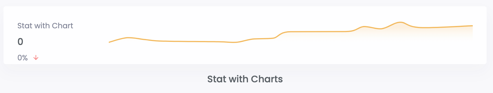
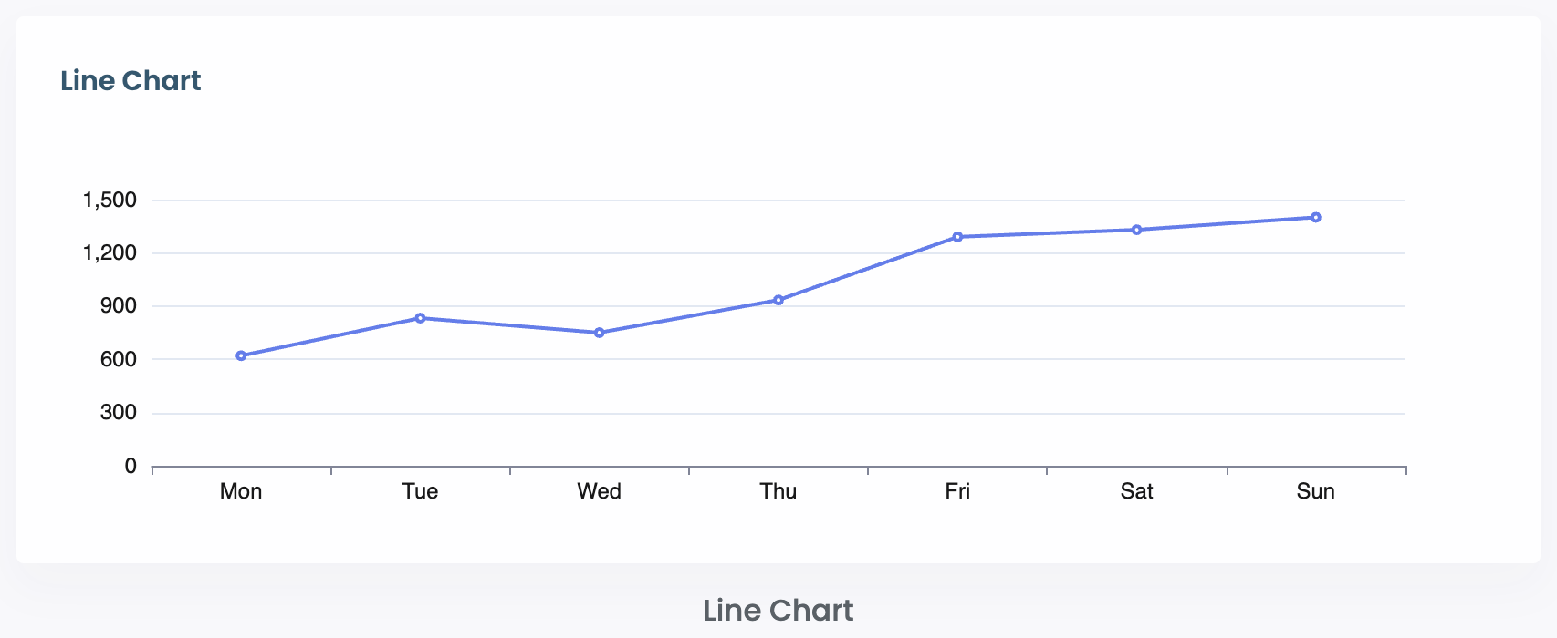
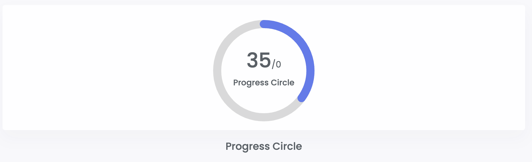
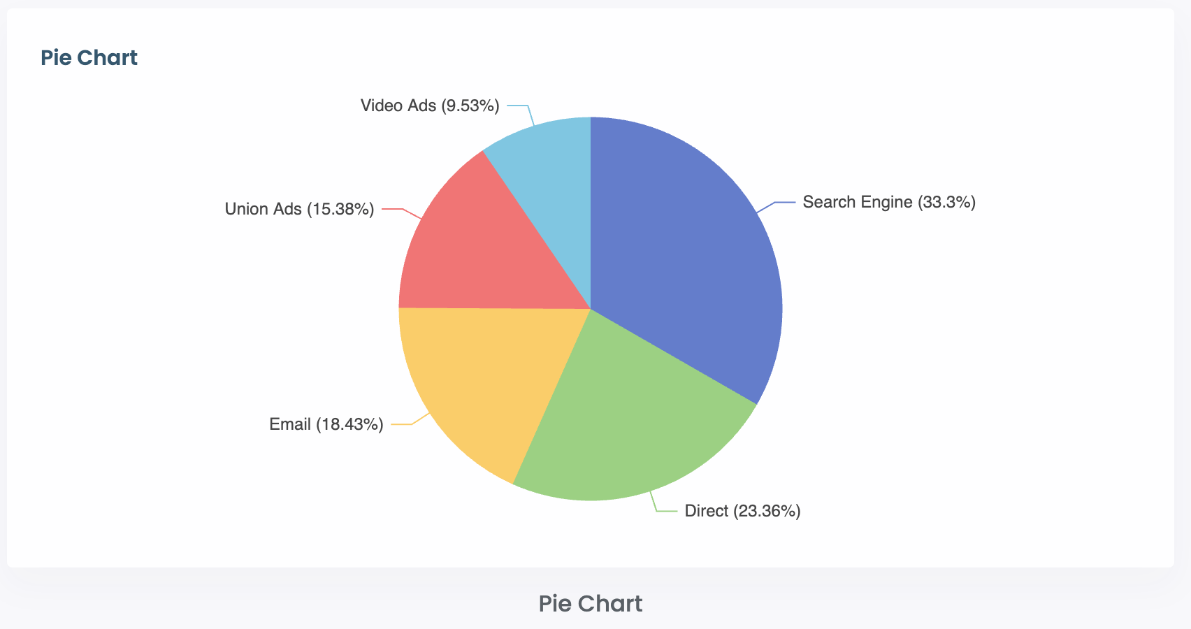
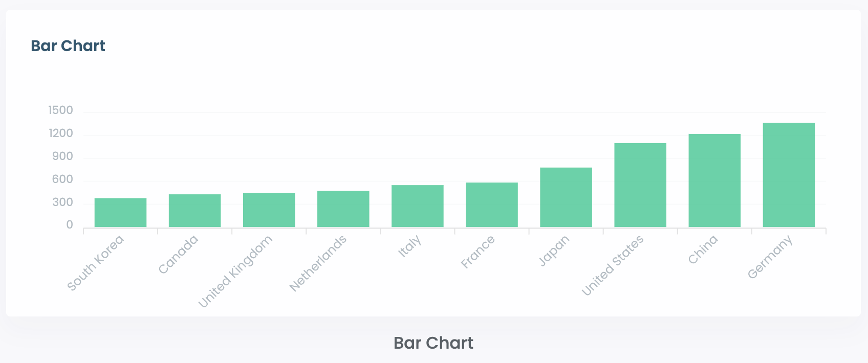
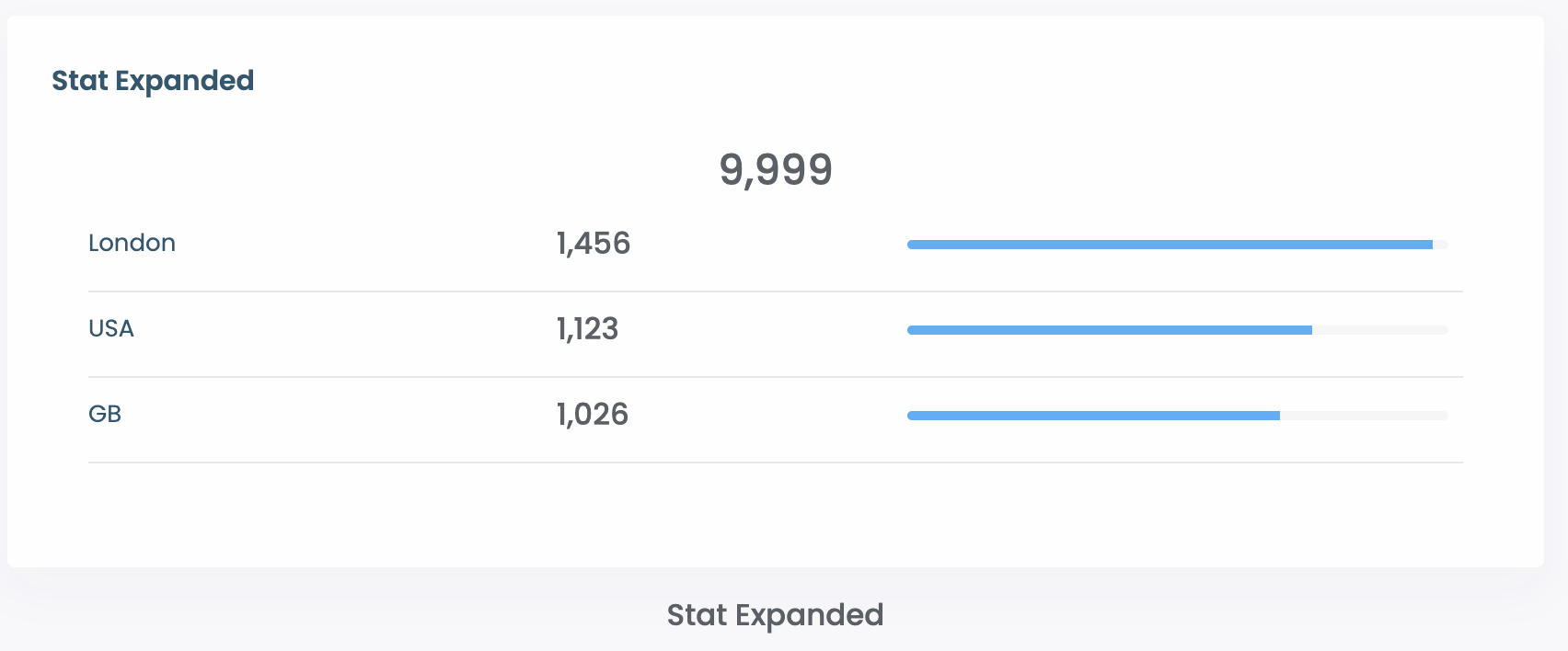
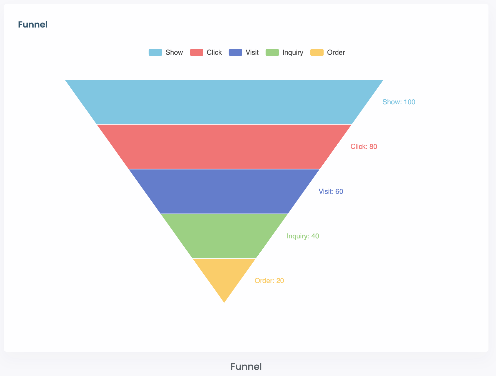
You can create a number of types of widgets including:
GrandCentr.al supports dynamic data input, enabling users to add values to their graphs on a daily basis and then switch to view them Weekly, Monthly, Quarterly and Yearly.
Every widget includes the ability to provide a Description so that users know how the information is calculated and the ability to drill down the information to see the supporting transactions and records that make up the metric.
For example, on Payments Received, you can see a calculation of the payments received and then drill down to see each of the transactions that make up the amount of payments received.
Overall GrandCentr.al dashboards are built to be able to provide all the important information and metrics based on what is going on in your business from the activity being taken care place in GC.
By have a CRM, Billing, Project Management, Support Ticketing, Training Platform, To-Dos, Checklists and a Company Library all in a single place, there is a large amount of activity that is happening and a great set of data and visualization of that activity available to you.
If you have any questions, or like to schedule a call with Kaeio, click here